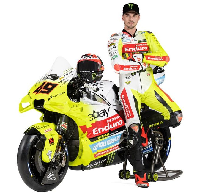
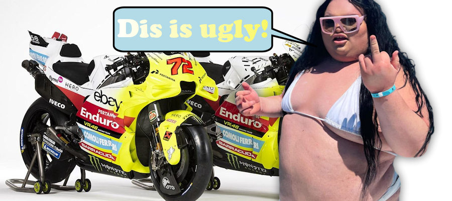
The VR46 Racing Team revealed their new 2024 livery and there were instant whisperings that it’s the most ugly thing to hit the MotoGP grid since Kurtis Robert took his helmet off unannounced pre-watershed.
But beauty is in the eye of the beholder – or so we’re told. Truth is people lie. These days the internet is awash with fat TikTok influencers parading their folds around whilst moronic viewers heap praise on them declaring they’re “stunning” and “utterly beautiful”. Luckily these influencers all die in their early 20s of morbid obesity or their ticker going for a burton.
So why do some people lie? Why tell some random fatso that she looks amazing knowing this will lead to her being wrapped in a crate of oak by 21? To look good in the eyes of others of course.
Luckily we at MotoGPNews have no real desire to look good. That boat’s sailed…and crashed. Instead we’ll analyse the talking points to discover if the VR46 Racing Team design is the worst of the year.

Yes it is
To quote a very intelligent person on X:
“It looks like someone took a 90s privateer livery and dipped it in custard.”
And once you see it, you can’t unsee it.
Unbelievably the design still looked bad even when Uccio was in the same frame.
It might be, but we’re not saying it
Some journalists were paid to attend the VR46 Racing Team launch. They also received free food, an overnight stay and some limited-edition Rossi merchandise – like the rare “2015 Champion” t-shirts.
Meanwhile other journalists, who may be overweight, are keen to tow the line to stay in favour with teams and thus gain access to interviews and, more crucially, the canteen area.
So it’s fair to presume that these upstanding (but usually sitting) journalists may have slightly skewered their view (which is usually of a high standard) to fit the narrative asked by the team?
No it’s not
Okay let’s address the elephant in the room – and not Sebastian Piffleton this time. This design is an eyesore and may cause headaches but we’ve still yet to see most of the other liveries.
Maybe 2024 will be the season where the top designers were sacked for cost cutting reasons and replaced by an executive bloke who decided to just cram as many sponsors on the bike as possible?
The fans
But what about the fans? Let’s see what a random MotoGP enthusiast thinks of the design.
“OMG! I think this is the best design on the grid – miles better than those traitor bastards at Gresini” explained one very neutral user. “It pays homage to Vale who is the very reason MotoGP is still popular today.”
Your vote
