It’s that time of year again. That time when looking at the slightly altered paintjobs of the 2021 MotoGP bikes is the most interesting thing we have to talk about. This year it’s even more crucially interesting as, thanks to pesky coronavirus, we’ve not even had any testing – which is especially bad news for Jorge Lorenzo as he was unable to tell us all via Twitter how good the Yamaha would have been with him as a tester.
So in our multi-part feature we’ll review the new liveries of each and every bike…or until we get sick of it.
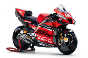
Ducati

As we’ve stated before the Ducati looks like a baboon’s arse – it’s red, angry looking and has loads of dangly bits that we’re not sure why they’re there.
Making the bike uglier Ducati has decided to randomly spray text-sponsors all over the bike. Different fonts, sizes and angles suggest it was designed by a group of Italians who have never met and don’t know how to work a Zoom call.
“We thought we saw a little bit of space for another sponsor” explained one designer “But we were wrong as it already had some text there…but it didn’t really matter as we just stuck another sponsor’s name over the top. It’s not like anyone ever reads them.”
Ultimately all the designers in all the worlds couldn’t ever make this bulbous monstrosity look easy on the eye. We suggest next season covering it in a mirror finish so hopefully it will reflect a better-looking bike. That probably goes for Jack Miller too.
MGPN Rating: ★★☆☆☆
Esponsorama Racing
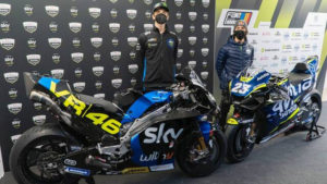
 What MotoGP desperately doesn’t need is another blue bike. Sadly that brief was missed by all at Esponsorama…speaking of which – Esponsorama – what kind of name is that? The low budget team dodged the usual press fanfare, that in fairness probably wouldn’t have bothered turning up anyway, by holding their launch in a rundown petrol station somewhere in Italy.
Esponsorama has two different liveries cleverly tied together with the common theme of both being woefully drab and probably designed on Microsoft Publisher in less than five minutes.
First up we have the Moto2 world champion Enea Bastianini on a blue bike with the sponsor’s name Avintia plastered across the side. Sadly it would appear that the design brief set by Avintia was to ‘make the text as big as possible…then make it a bit bigger’ resulting in most of it not being visible and definitely unreadable. Good work.
Not wanting to be outdone by big, garish fonts the next bike is sponsored by the midfield legend Valentino ‘The Dentist’ Rossi and predicably has a “VR46” sticker on the side. The rest of the bike is black and boring.
Conveniently riding the VR46 bike will be Neopbro Marini – a rider who has shot to fame by being related to an actual famous rider.
MGPN Rating: ★☆☆☆☆
Next up…the KTMs